

Flora Health

TL:DR

The challenge
Flora Health was a new retail concept aiming to stand out in the crowded wellness market. The challenge was to create a brand that communicated trust, calm, and natural well-being—while ensuring the in-store experience felt clear, welcoming, and aligned with the brand’s values. They needed a visual identity and signage system that worked seamlessly together to guide customers and reinforce their message of holistic health.


The solution
We began by crafting a visual identity rooted in the idea of gentle, natural vitality. The logo was designed to feel approachable and modern, paired with an earthy colour palette and clean, rounded typography to evoke calmness and clarity. These elements formed the foundation of a brand that felt both grounded and professional.
For the retail space, we created signage that not only supported navigation but extended the brand’s tone and style into the physical environment. Every design choice—from the typography on signs to the illustrations used across touchpoints—was made to create a cohesive, sensory brand experience that put customers at ease and encouraged exploration.

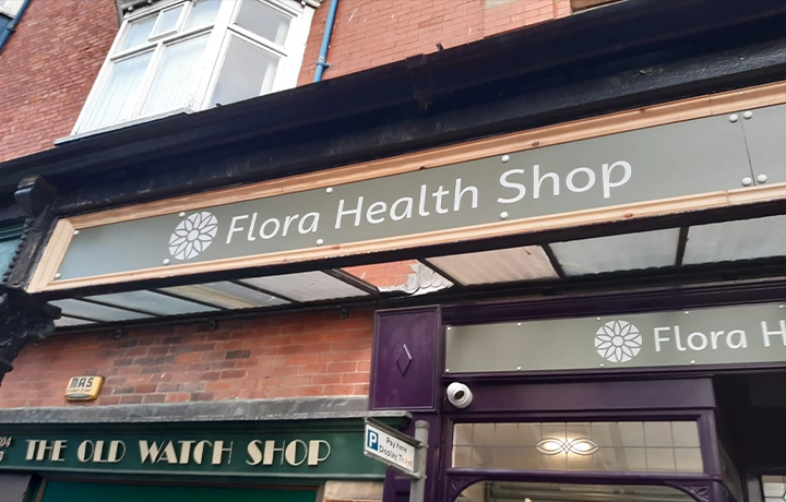

The results
✅ A fresh, nature-inspired brand identity that positions Flora Health as a trusted wellness destination
✅ Thoughtfully designed in-store signage that enhances the shopping experience while reinforcing brand values
✅ A strong visual presence that supports both in-store engagement and future growth into digital and print touchpoints

In summary
Flora Health demonstrates how strong branding and thoughtful environmental design can turn a retail concept into a memorable, meaningful experience. If you're launching a physical product or wellness space, we’d love to help your vision take root.
📩 Let’s talk about how to bring your brand to life.

The digital experience your brand derserves
Don’t settle for ordinary. Let’s create something extraordinary together.


